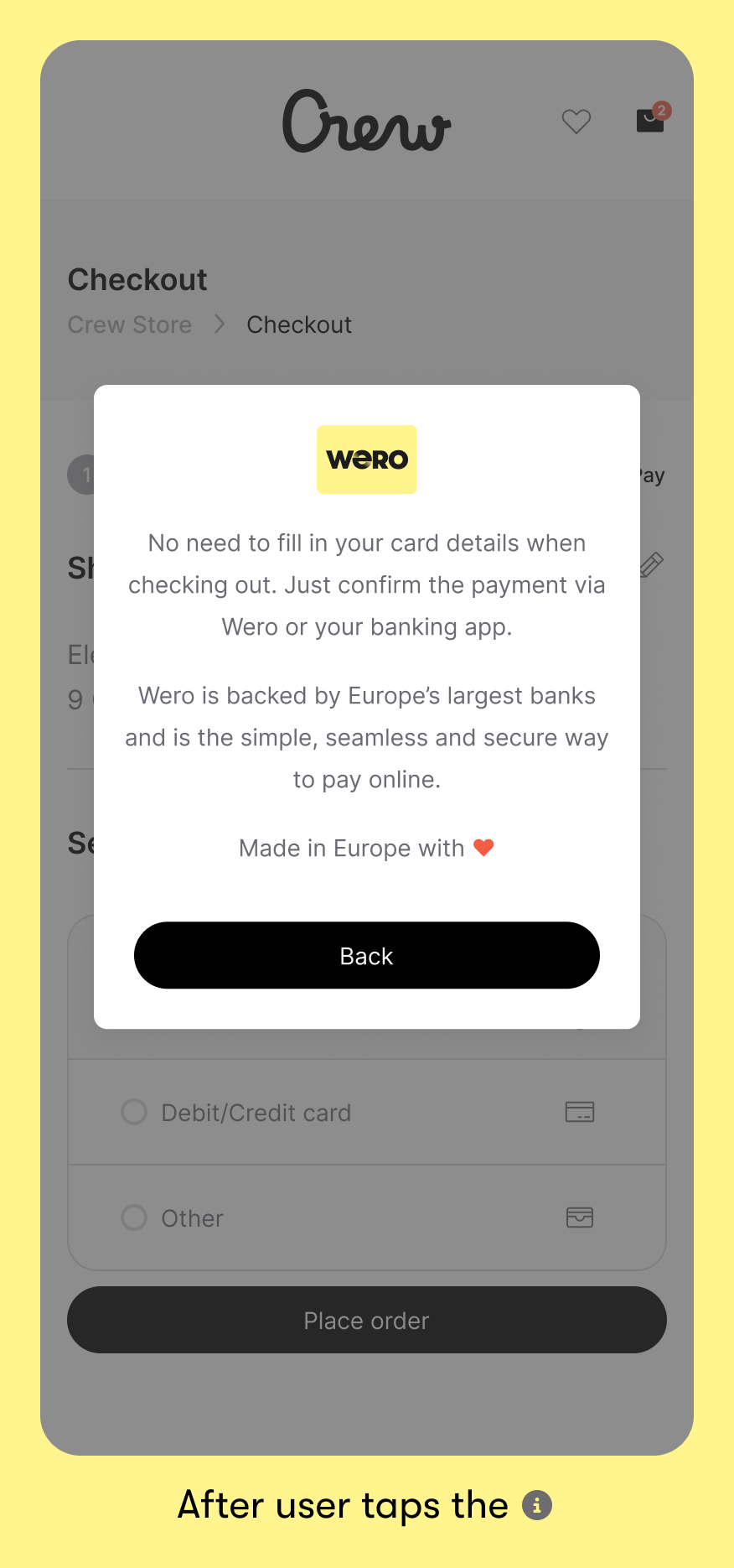
Because Wero may still be unfamiliar to some, an explanation can help remove hesitation and support people in completing their payment. Placing an info icon next to the name offers a quick way to build confidence, without interrupting the checkout flow or sending people elsewhere.
Skip to guideline content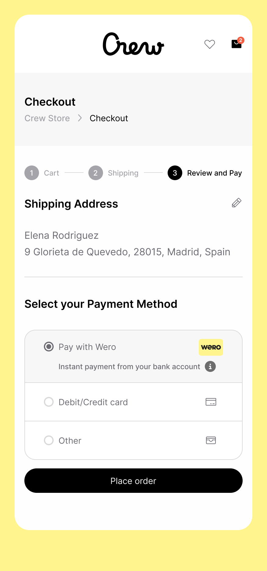

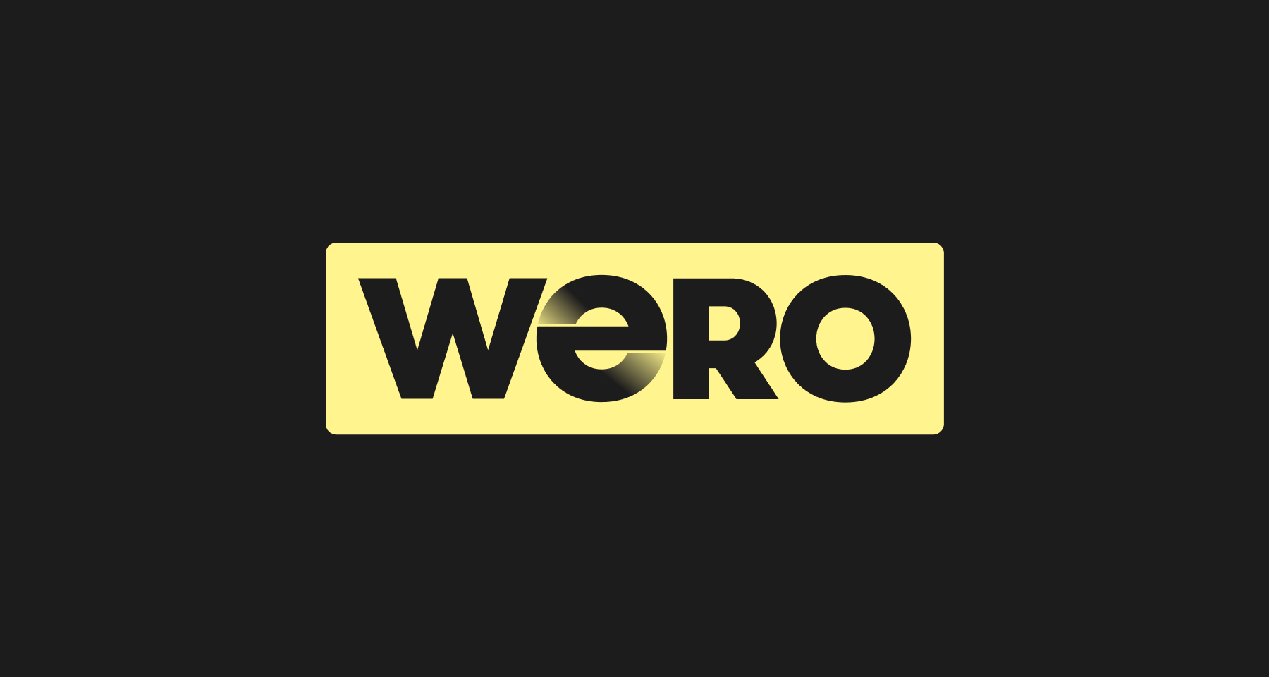
HOW TO PRESENT WERO AT CHECKOUT.
Checkout is a key touchpoint for the Wero brand.
Our guidelines ensure clear, consistent placement of Wero, so people can choose Wero easily and complete their payment with confidence.
Made in Europe with love, Wero is designed to make payments simple, secure, and trustworthy.
UX Checkout Guidelines
1. Payment page
a) list layout
For merchants who show payment options as a list, similar to the examples shown below.
Consistent messaging reinforces the Wero brand consistently, helping your customers build and maintain that all-important trust. When you show Wero with the other payment options in your checkout flow, please use:
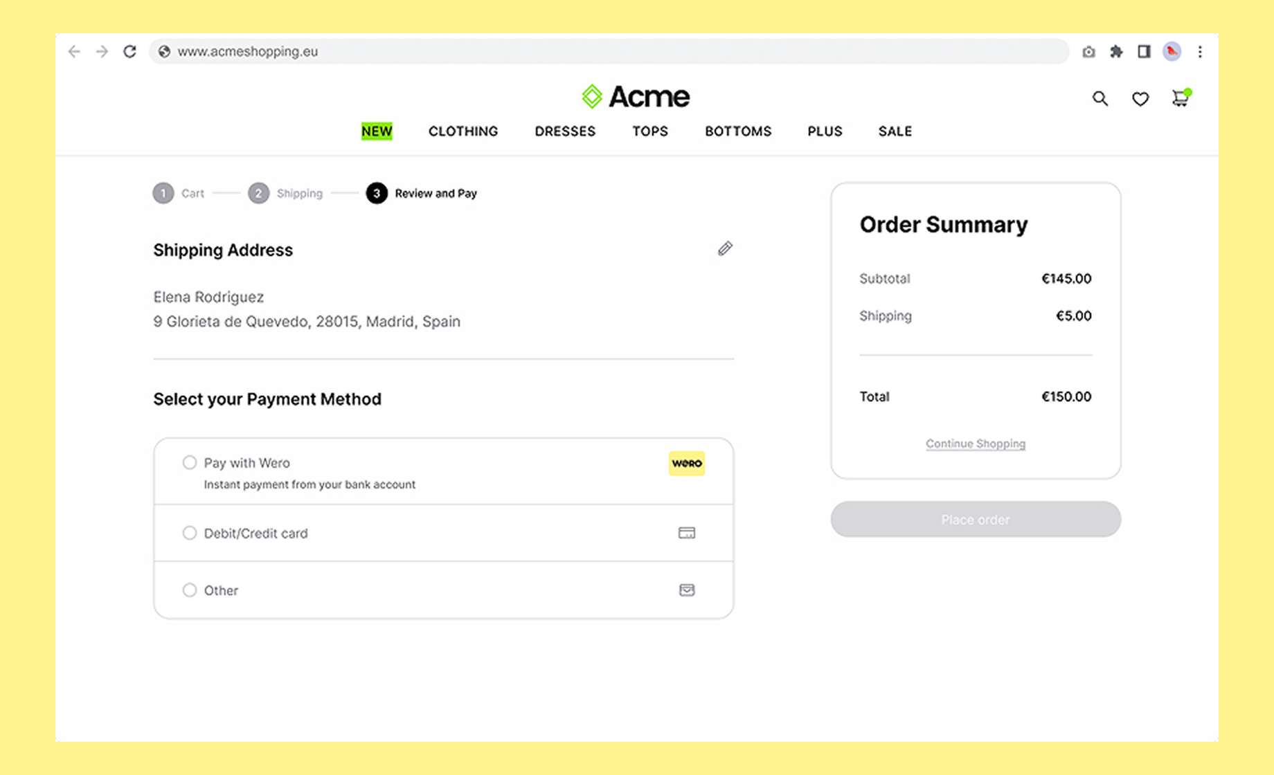
- Title: Pay with Wero
- Tagline underneath: Instant payment from your bank account
- Include an Info icon with additional information on click
Visual examples
Mobile smartphone
Desktop
Wero is made in Europe - for Europe
This content is available in the languages of markets where Wero is currently live.
Copy
Title
Pay with Wero
Tagline
Instant payment from your bank account
Additional info shown when info icon is clicked
No need to fill in your card details when checking out. Just confirm the payment via Wero or your banking app.
Wero is backed by Europe’s largest banks and is the simple, seamless and secure way to pay online.Made in Europe with ❤️
Wero is made in Europe - for Europe
This content is available in the languages of markets where Wero is currently live.Title
Bezahl mit Wero
Tagline
Sofortzahlung von deinem Bankkonto
Additional info shown when info icon is clicked
Beim Bezahlen musst du keine Kartendaten eingeben. Bestätige die Zahlung einfach über Wero oder deine Banking-App.
Wero wird von Europas größten Banken unterstützt und ist eine einfache und sichere Art, online zu bezahlen.Made in Europe with ❤️
Title
Betaal met Wero
Tagline
Instant payment from your bank account
Additional info shown when info icon is clicked
Je hoeft bij het afrekenen geen kaartgegevens in te vullen. Bevestig de betaling via Wero of je bankapp.
Wero wordt ondersteund door Europa’s grootste banken en maakt online betalen eenvoudig en veilig.
Made in Europe with ❤️
Title
Payer avec Wero
Tagline
Paiement instantané depuis votre compte bancaire
Additional info shown when info icon is clicked
Vous n’avez pas besoin de saisir vos coordonnées bancaires lors du paiement. Il vous suffit de confirmer la transaction via Wero ou votre application bancaire.
Soutenu par les plus grandes banques européennes, Wero offre un moyen simple et sécurisé de payer en ligne.Made in Europe with ❤️
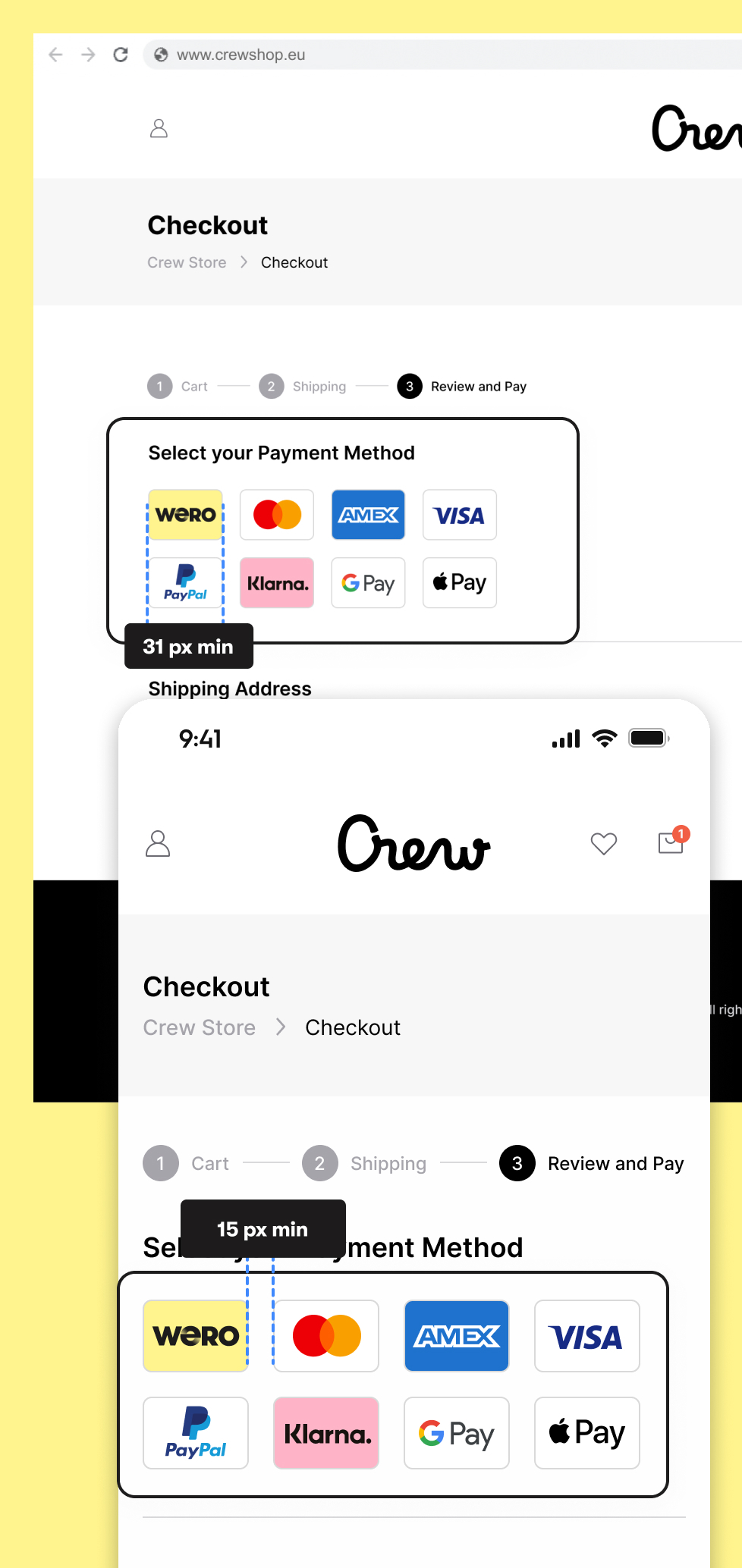
b) logo layout
For merchants who show payment options as logos, similar to the examples below, follow these guidelines:
Minium size of our acceptor card:
31px width min:
A readable logo size is essential. If it’s too small, users may not recognize it or understand what to do, impacting both conversion and user experience. Therefore, our freedom and control design principles are not up to standard.
Minimum margin between logos:
15px min:
Adequate spacing ensures each logo is clearly clickable. Tight margins can lead to misclicks, especially from an accessibility standpoint.
Mouse hover interaction: (when applicable)
The user should understand what he is supposed to do next. On desktop, a subtle hover effect (like a highlight) helps users understand the logo is clickable.
Control: (when applicable)
The Wero logo should have a text label that will appear if there is any image problem. It will also be used from an accessibility point of view to let the user what the wero logo is doing.
E.g. Pay with Wero, Wero your new payment experience (When possible, the text label should be localized)
2. Sending the user to Wero environment
User is always sent to the Wero central services environment at pay.weropay.eu, which must always be done on the same window tab:
- Bank selector page on mobile (smartphone)
After tapping the Wero button on mobile, the Wero page should open directly. This ensures a seamless and intuitive transition for the user. - QR page on desktop (or laptop/tablet)
The new page should open within the same window to avoid any confusion from the user's perspective. Opening a new tab or window could disrupt the flow and create uncertainty.
Redirection back to the merchant (back button)
The user should be able to go back to the merchant website at any time.
More technical info here
Only show Wero in supported markets (recommendation)
From the billing address, acceptors & merchants should know which country the user is from. If this is not a Wero-supported market, we recommend not showing Wero as a payment option.
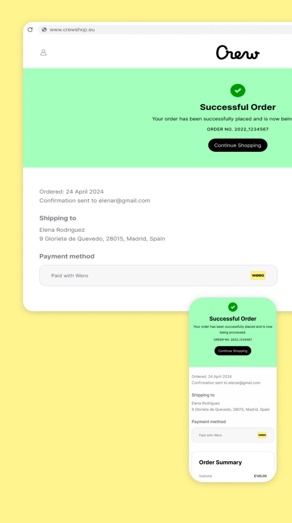
3. Success page
The Success page serves both as a recap and a confirmation of the transaction.
Coherence: (when applicable)
The Wero checkout card should be clearly displayed on the page, accompanied by a message such as: “Your payment was successfully processed with Wero.”
This reassures the user that the transaction was completed correctly via Wero.
Responsiveness: (when applicable)
The checkout card should be seen in the immediately visible area on both mobile and desktop devices. A hidden or missing logo may raise doubts for users. On a Thank You page, we want to eliminate any uncertainty.
Control (when applicable)
The Wero logo should have a text label that will appear if there is any image problem. It will also be used from an accessibility point of view to let the user what is the Wero logo doing.
E.g. payment done with Wero
Brand Guidelines
A consistent brand is the key to consumer trust. Our brand guidelines help you make sure every Wero payment looks like Wero, sounds like Wero and feels like Wero, every single time.
Brand assets for marketing
Wero badge
The Wero badge is a variant of the Wero logo, designed for instant brand recognition. You can use it to announce Wero in your emails, landing pages and other communication materials.
Brand assets for checkout
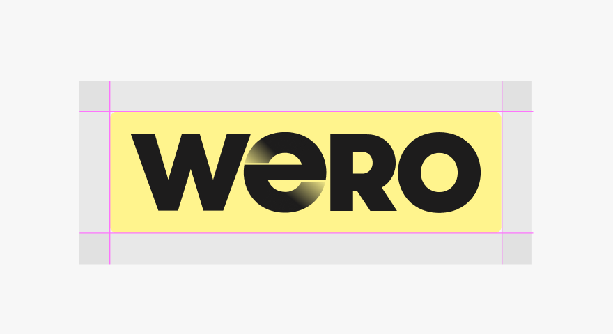
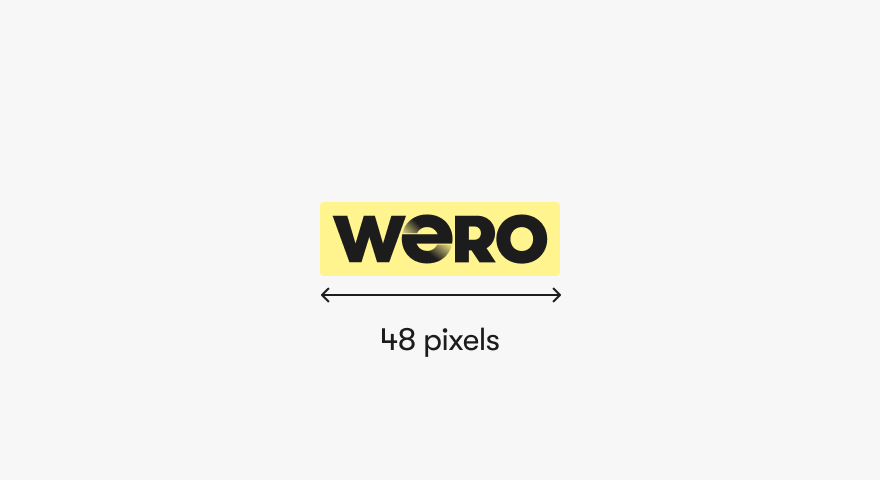
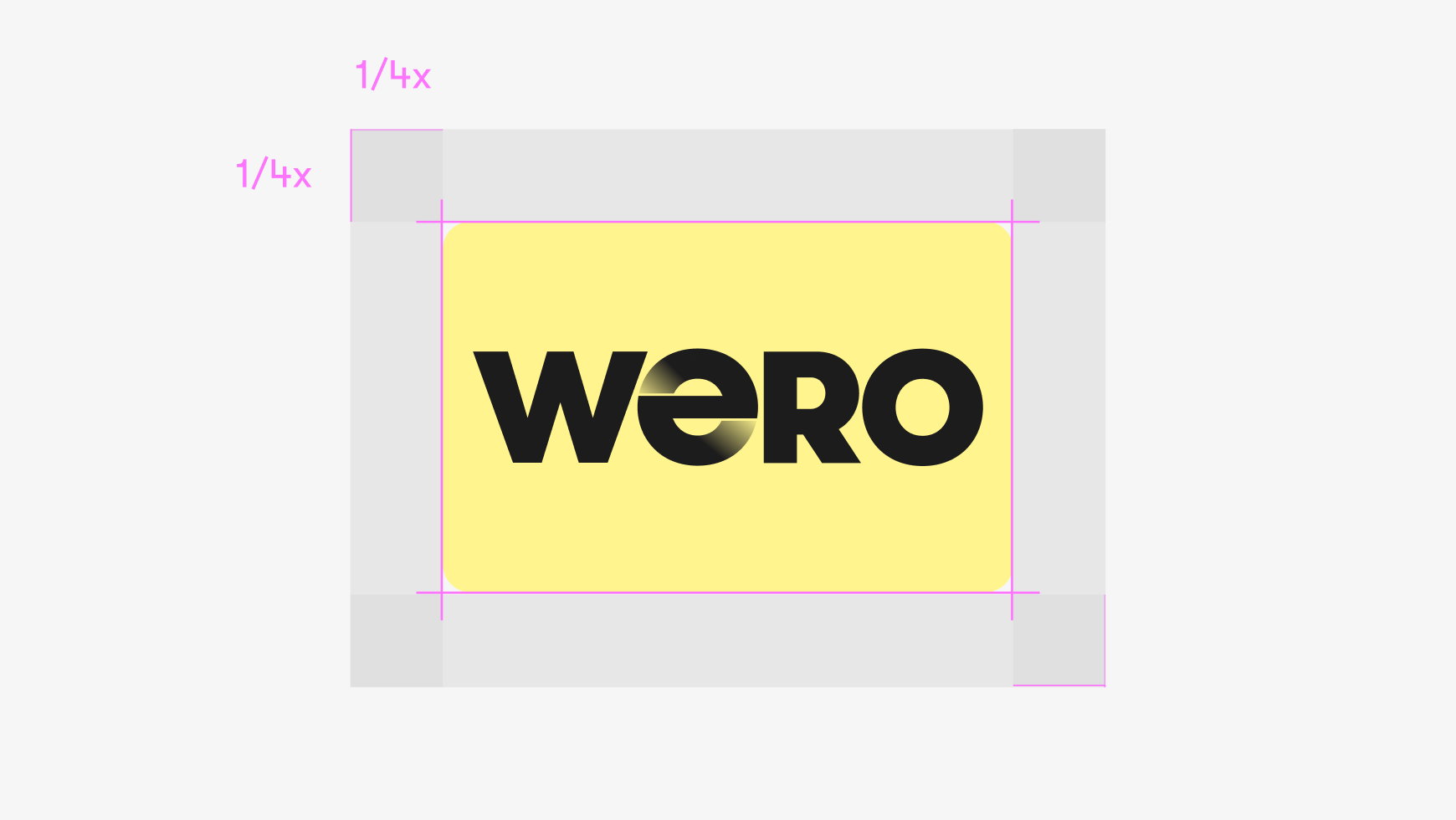
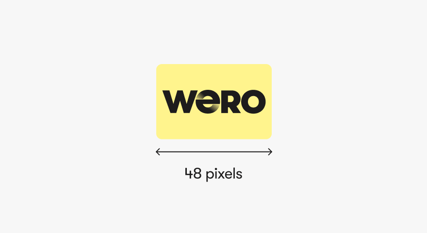
Wero Checkout Card
The Wero checkout card presents Wero as an available payment method at checkout. The card is based on a standard format so it will sit nicely alongside other payment methods.
Marketing Guidelines
Consistent messaging reinforces the Wero brand consistently, helping your customers build and maintain that all-important trust.
Messaging guidelines
Let your customers know that they can pay with Wero when they buy from you online with messaging across all your channels.
Simple and fast
Pay online straight from the Wero app or your banking app. No long IBANs or numbers to enter: all you need is your phone.
Reliable and secure
Wero is built to Europe’s high security and data protection standards.
Supported by your bank
Wero is linked to your regular bank account. It keeps all your expenses in one place to give you more control.
Made in Europe
Wero is backed by some of Europe’s largest banks. It’s designed in Europe to be a simple, sovereign payment experience for as many people as possible.
Marketing examples
Let your customers know that they can pay with Wero when they buy from you online with messaging across all your channels.
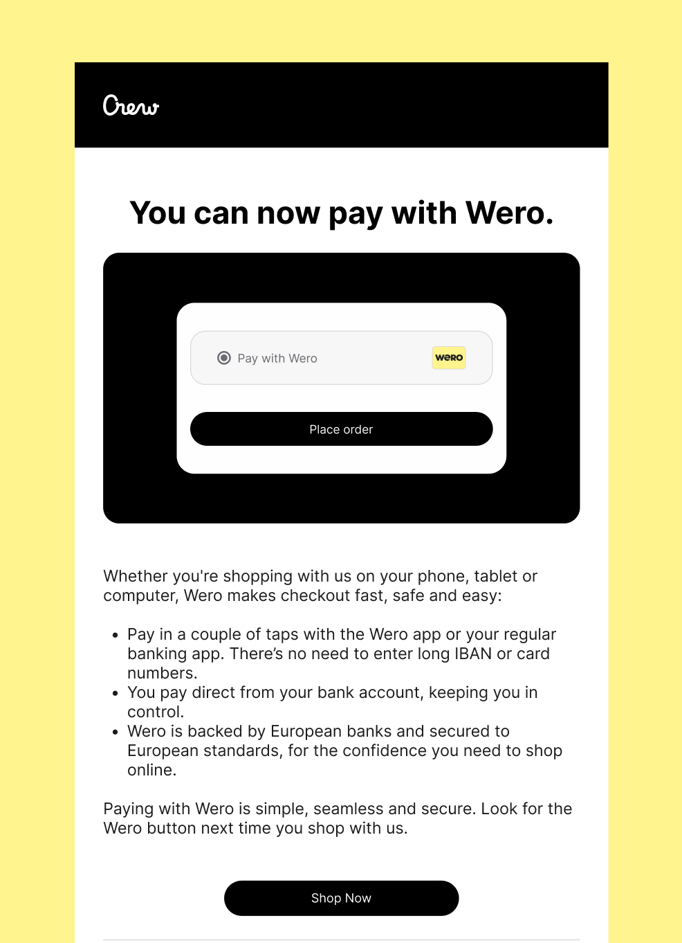
Marketing email
Telling your customers by email that next time they visit your store they can pay with Wero is a great way to build curiosity. Feel free to adapt this email, which contains the key messages people need to know so they can feel confident paying with Wero.
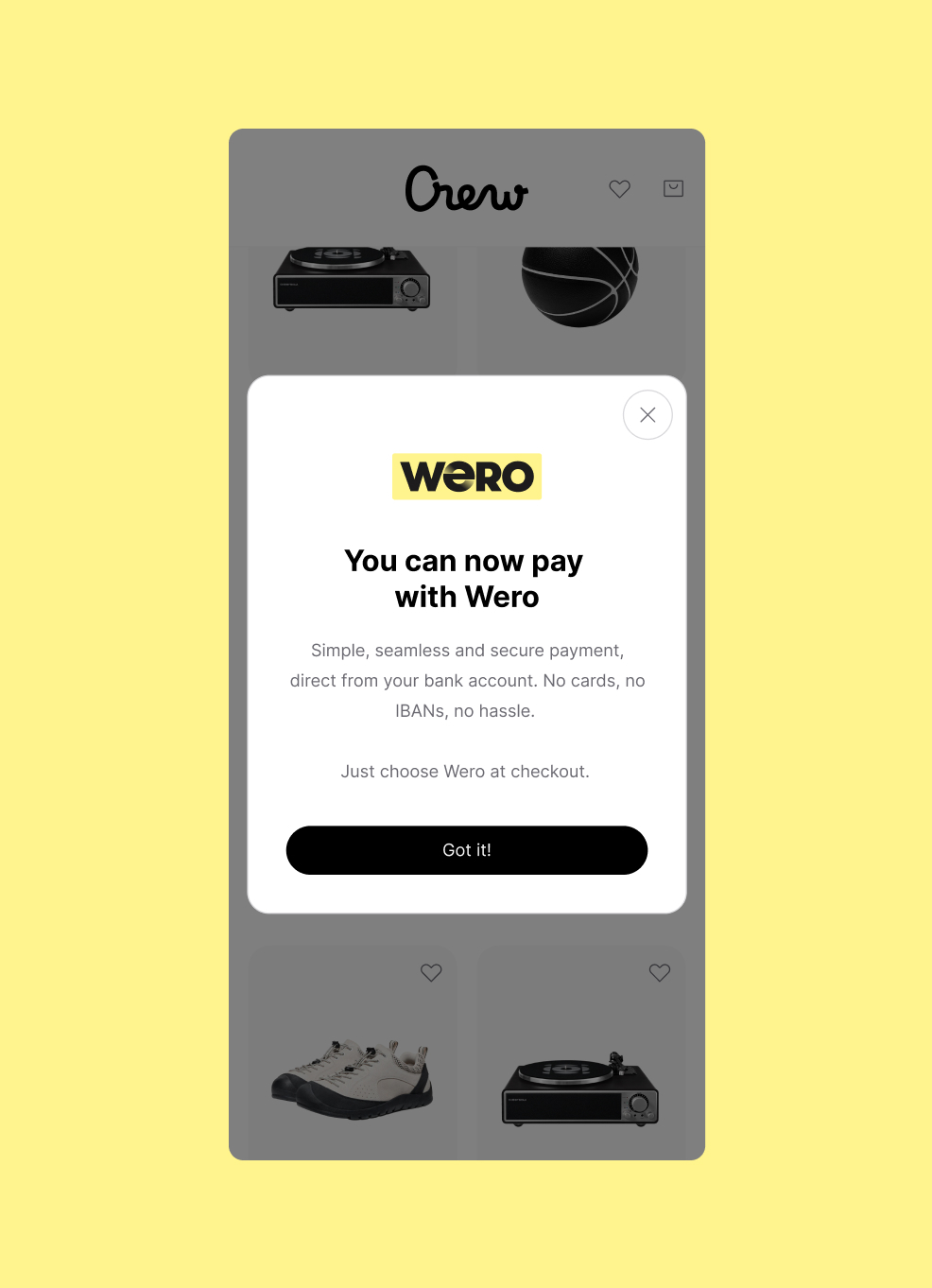
App Pop-Up
A one-time app popup announcing that Wero is now available in your checkout is another non-intrusive way to introduce your customers to our brand.
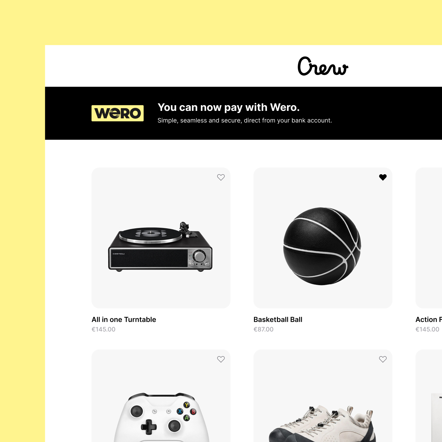
Website banner
Check out our PSP partners to implement Wero.
You can contact your own acquirer for more questions - check the list here
UX Checkout Guidelines
1. Payment page
Because Wero may still be unfamiliar to some, an explanation can help remove hesitation and support people in completing their payment. Placing an info icon next to the name offers a quick way to build confidence, without interrupting the checkout flow or sending people elsewhere.
a) list layout
For merchants who show payment options as a list, similar to the examples shown below.
Consistent messaging reinforces the Wero brand consistently, helping your customers build and maintain that all-important trust. When you show Wero with the other payment options in your checkout flow, please use:
- Title: Pay with Wero
- Tagline underneath: Instant payment from your bank account
- Include an Info icon with additional information on click
Visual examples
Mobile smartphone
Desktop
Wero is made in Europe - for Europe
This content is available in the languages of markets where Wero is currently live.
Copy
Title
Pay with Wero
Tagline
Instant payment from your bank account
Additional info shown when info icon is clicked
No need to fill in your card details when checking out. Just confirm the payment via Wero or your banking app.
Wero is backed by Europe’s largest banks and is the simple, seamless and secure way to pay online.Made in Europe with ❤️
Wero is made in Europe - for Europe
This content is available in the languages of markets where Wero is currently live.Title
Bezahl mit Wero
Tagline
Sofortzahlung von deinem Bankkonto
Additional info shown when info icon is clicked
Beim Bezahlen musst du keine Kartendaten eingeben. Bestätige die Zahlung einfach über Wero oder deine Banking-App.
Wero wird von Europas größten Banken unterstützt und ist eine einfache und sichere Art, online zu bezahlen.Made in Europe with ❤️
Title
Betaal met Wero
Tagline
Instant payment from your bank account
Additional info shown when info icon is clicked
Je hoeft bij het afrekenen geen kaartgegevens in te vullen. Bevestig de betaling via Wero of je bankapp.
Wero wordt ondersteund door Europa’s grootste banken en maakt online betalen eenvoudig en veilig.
Made in Europe with ❤️
Title
Payer avec Wero
Tagline
Paiement instantané depuis votre compte bancaire
Additional info shown when info icon is clicked
Vous n’avez pas besoin de saisir vos coordonnées bancaires lors du paiement. Il vous suffit de confirmer la transaction via Wero ou votre application bancaire.
Soutenu par les plus grandes banques européennes, Wero offre un moyen simple et sécurisé de payer en ligne.Made in Europe with ❤️
b) logo layout
For merchants who show payment options as logos, similar to the examples below, follow these guidelines:
Minium size of our acceptor card:
31px width min:
A readable logo size is essential. If it’s too small, users may not recognize it or understand what to do, impacting both conversion and user experience. Therefore, our freedom and control design principles are not up to standard.
Minimum margin between logos:
15px min:
Adequate spacing ensures each logo is clearly clickable. Tight margins can lead to misclicks, especially from an accessibility standpoint.
Mouse hover interaction: (when applicable)
The user should understand what he is supposed to do next. On desktop, a subtle hover effect (like a highlight) helps users understand the logo is clickable.
Control: (when applicable)
The Wero logo should have a text label that will appear if there is any image problem. It will also be used from an accessibility point of view to let the user what the wero logo is doing.
E.g. Pay with Wero, Wero your new payment experience (When possible, the text label should be localized)
2. Sending the user to Wero environment
User is always sent to the Wero central services environment at pay.weropay.eu, which must always be done on the same window tab:
- Bank selector page on mobile (smartphone)
After tapping the Wero button on mobile, the Wero page should open directly. This ensures a seamless and intuitive transition for the user. - QR page on desktop (or laptop/tablet)
The new page should open within the same window to avoid any confusion from the user's perspective. Opening a new tab or window could disrupt the flow and create uncertainty.
Redirection back to the merchant (back button)
The user should be able to go back to the merchant website at any time.
More technical info here
Only show Wero in supported markets (recommendation)
From the billing address, acceptors & merchants should know which country the user is from. If this is not a Wero-supported market, we recommend not showing Wero as a payment option.
3. Success page
The Success page serves both as a recap and a confirmation of the transaction.
Coherence: (when applicable)
The Wero checkout card should be clearly displayed on the page, accompanied by a message such as: “Your payment was successfully processed with Wero.”
This reassures the user that the transaction was completed correctly via Wero.
Responsiveness: (when applicable)
The checkout card should be seen in the immediately visible area on both mobile and desktop devices. A hidden or missing logo may raise doubts for users. On a Thank You page, we want to eliminate any uncertainty.
Control (when applicable)
The Wero logo should have a text label that will appear if there is any image problem. It will also be used from an accessibility point of view to let the user what is the Wero logo doing.
E.g. payment done with Wero
Brand Guidelines
A consistent brand is the key to consumer trust. Our brand guidelines help you make sure every Wero payment looks like Wero, sounds like Wero and feels like Wero, every single time.
Brand assets for marketing
Wero badge
The Wero badge is a variant of the Wero logo, designed for instant brand recognition. You can use it to announce Wero in your emails, landing pages and other communication materials.
Brand assets for checkout
Wero Checkout Card
The Wero checkout card presents Wero as an available payment method at checkout. The card is based on a standard format so it will sit nicely alongside other payment methods.
Marketing Guidelines
Consistent messaging reinforces the Wero brand consistently, helping your customers build and maintain that all-important trust.
Messaging guidelines
Let your customers know that they can pay with Wero when they buy from you online with messaging across all your channels.
Simple and fast
Pay online straight from the Wero app or your banking app. No long IBANs or numbers to enter: all you need is your phone.
Reliable and secure
Wero is built to Europe’s high security and data protection standards.
Supported by your bank
Wero is linked to your regular bank account. It keeps all your expenses in one place to give you more control.
Made in Europe
Wero is backed by some of Europe’s largest banks. It’s designed in Europe to be a simple, sovereign payment experience for as many people as possible.
Marketing examples
Let your customers know that they can pay with Wero when they buy from you online with messaging across all your channels.
Marketing email
Telling your customers by email that next time they visit your store they can pay with Wero is a great way to build curiosity. Feel free to adapt this email, which contains the key messages people need to know so they can feel confident paying with Wero.
App Pop-Up
A one-time app popup announcing that Wero is now available in your checkout is another non-intrusive way to introduce your customers to our brand.
Website banner
Check out our PSP partners to implement Wero.
You can contact your own acquirer for more questions - check the list here